 爱站程序员基地
每日CSS_霓虹灯按钮悬停效果
2020_12_20

源码链接
1. 代码解析
1.1 html 代码片段解析
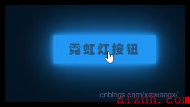
<a href=\"#\"><span></span><span></span><span></span><span></span>霓虹灯 按钮</a>
这四个 span 标签用来模拟上下左右四根线
1.2 CSS 代码片段解析
-
body 代码
body{margin: 0;padding: 0;/* flex 布局 */display: flex;justify-content: center;align-items: center;min-height: 100vh;background: #031321;font-family: 华文琥珀;}应用到了 flex 布局, 将内容显示在屏幕中央
-
a 标签
a{/* 为绝对定位做参考点 */position: relative;display: inline-block;/* 将文字与线分割开 */padding: 15px 30px;color: #2196f3;/* 文字间隔 */letter-spacing: 4px;text-decoration: none;font-size: 24px;/* 隐藏越界的线 */overflow: hidden;/* 附在 a 上的动画, 触发时和回退时均有效 */transition: 0.2s;}需要注意的是 transition, 放在 a 标签而不是 a:hover 标签里的原因是, 放在 a 标签, 移入移出均有效果, 而放在 a:hover 中, 移入有效果, 移出没效果
-
a:hover
a:hover{color: #255784;background: #2196f3;/* 多个阴影模拟霓虹灯 */box-shadow:0 0 10px #2196f3,0 0 40px #2196f3,0 0 10px #2196f3,0 0 80px #2196f3;/* 有延迟 */transition-delay: 1s;}这里有三个动画, color, backgroud 和 box-shadow, background 由透明变为 #2196f3, 效果对比如下

-
最重要的移动线条
a span{position: absolute;display: block;}a span:nth-child(1){top: 0;left: -100%;width: 100%;height: 2px;background: linear-gradient(90deg, transparent, #2196f3);}a:hover span:nth-child(1){left: 100%;transition: 1s;}首先, 将所有的 span 设为绝对定位, a 为相对定位. 将上方的线从左边移动到右边, 在 a 选择器中设置了 overflow: hidden, 因此越界的线被隐藏了. 将 left 固定为 0 的效果如下.

当left从 -100% 到 100% 是就有了闪过的效果,
-
再介绍一个右边的线条, 其余的一样
a span:nth-child(2){right: 0;top: -100%;width: 2px;height: 100%;background: linear-gradient(180deg, transparent, #2196f3);}a:hover span:nth-child(2){top: 100%;transition: 1s .25s;}注意, background, 是一根竖线, 宽 2px, 高 100%, 若 top 一直为 0 时效果如下


2. 源码如下
-
html
<!DOCTYPE html><html><head><meta charset=\"utf-8\"><title></title><link rel=\"stylesheet\" href=\"2020_12_20.css\"></head><body><a href=\"#\"><span></span><span></span><span></span><span></span>霓虹灯 按钮</a></body></html>
-
css
body{margin: 0;padding: 0;/* flex 布局 */display: flex;justify-content: center;align-items: center;min-height: 100vh;background: #031321;font-family: 华文琥珀;}a{/* 为绝对定位做参考点 */position: relative;display: inline-block;/* 将文字与线分割开 */padding: 15px 30px;color: #2196f3;/* 文字间隔 */letter-spacing: 4px;text-decoration: none;font-size: 24px;overflow: hidden;/* 附在 a 上的动画, 触发时和回退时均有效 */transition: 0.2s;}a:hover{color: #255784;background: #2196f3;/* 多个阴影模拟霓虹灯 */box-shadow:0 0 10px #2196f3,0 0 40px #2196f3,0 0 10px #2196f3,0 0 80px #2196f3;/* 有延迟 */transition-delay: 1s;}a span{position: absolute;display:56cblock;}a span:nth-child(1){top: 0;left: -100%;width: 100%;height: 2px;background: linear-gradient(90deg, transparent, #2196f3);}a:hover span:nth-child(1){left: -100%;transition: 1s;}a span:nth-child(3){bottom: 0;left: 100%;width: 100%;height: 2px;background: linear-gradient(270deg, transparent, #2196f3);}a:hover span:nth-child(3){left: -100%;transition: 1s .5s;}a span:nth-child(2){right: 0;top: -100%;width: 2px;height: 100%;background: linear-gradient(180deg, transparent, #2196f3);}a:hover span:nth-child(2){top: 100%;transition: 1s .25s;}a span:nth-child(4){left: 0;top: 100%;width: 2px;height: 100%;background: linear-gradient(360deg, transparent, #2196f3);}a:hover span:nth-child(4){top: -100%;transition: 1s .75s;}


