 爱站程序员基地
情境引入
我们在做机器学习相关项目时,常常会分析数据集的样本分布,而这就需要用到直方图的绘制。
在Python中可以很容易地调用
matplotlib.pyplot
的
hist
函数来绘制直方图。不过,该函数参数不少,有几个绘图的小细节也需要注意。
首先,我们假定现在有个联邦学习的项目情景。我们有一个样本个数为15的图片数据集,样本标签有4个,分别为
cat
,
dog
,
car
,
ship
。这个数据集已经被不均衡地划分到4个任务节点(client)上,如像下面表示:
N_CLIENTS = 3num_cls, classes = 4, [\'cat\', \'dog\', \'car\', \'ship\']train_labels = [0, 3, 2, 0, 3, 2, 1, 0, 3, 3, 1, 0, 3, 2, 2] #数据集的标签列表client_idcs = [slice(0, 4), slice(4, 11), slice(11, 15)]# 数据集样本在client上的划分情况
我们需要可视化样本在任务节点的分布情况。我们第一次可能会写出如下代码:
import matplotlib.pyplot as pltimport numpy as npplt.figure(figsize=(5,3))plt.hist([train_labels[idc]for idc in client_idcs], stacked=False,bins=num_cls,label=["Client {}".format(i) for i in range(N_CLIENTS)])plt.xticks(np.arange(num_cls), classes)plt.legend()plt.show()
此时的可视化结果如下:
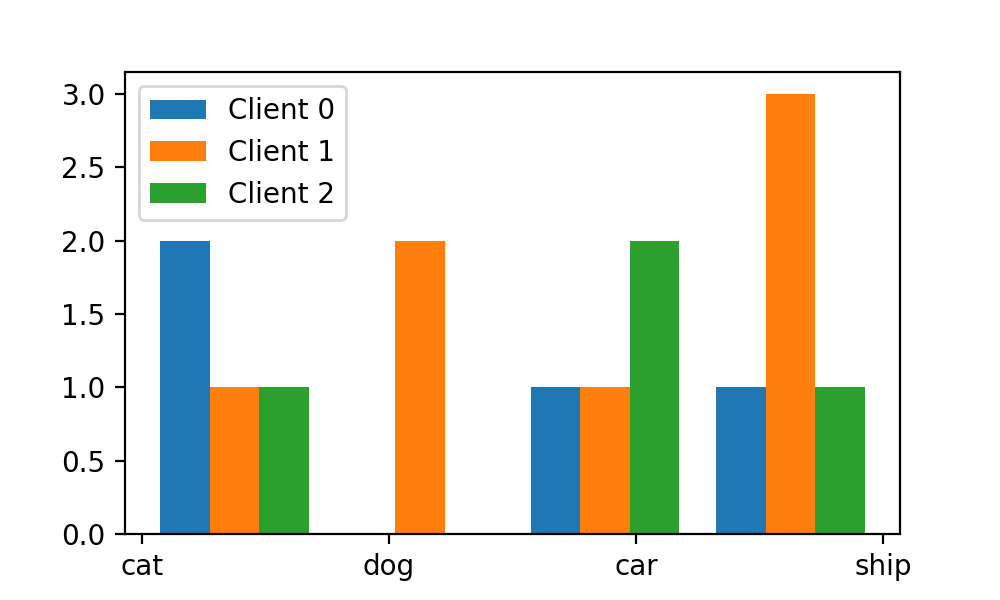
这时我们会发现,我们x轴上的标签和上方的bar(每个图像类别对应的3个bar合称为1个bin)并没有对齐,而这时剧需要我们调整
bins
这个参数。
bins 参数
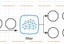
在讲述bins参数之前我们先来熟悉一下
hist
绘图中bin和bar的含义。下面是它们的诠释图:

这里$x_1$、$x_2$是x轴对象,在
hist
中,默认x轴第一个对象对应刻度为0,第2个对象刻度为1,依次类图。在这个诠释图上,bin(原意为垃圾箱)就是指每个x轴对象所占优的矩形绘图区域,bar(原意为块)就是指每个矩形绘图区域中的条形。 如上图所示,x轴第一个对象对应的bin区间为[-0.5, 0.5),第2个对象对应的bin区域为[0.5, 1)(注意,
hist
规定一定是左闭又开)。每个对象的bin区域内都有3个bar。
通过查阅
matplotlib
文档,我们知道了
bins
参数的解释如下:
bins: int or sequence or str, default: rcParams["hist.bins"] (default: 10)
If bins is an integer, it defines the number of equal-width bins in the range.
If bins is a sequence, it defines the bin edges, including the left edge of the first bin and the right edge of the last bin; in this case, bins may be unequally spaced. All but the last (righthand-most) bin is half-open. In other words, if bins is:
[1, 2, 3, 4]
then the first bin is [1, 2) (including 1, but excluding 2) and the second [2, 3). The last bin, however, is [3, 4], which includes 4.
If bins is a string, it is one of the binning strategies supported by numpy.histogram_bin_edges: \’auto\’, \’fd\’, \’doane\’, \’scott\’, \’stone\’, \’rice\’, \’sturges\’, or \’sqrt\’.
我来概括一下,也就是说如果
bins
是个数字,那么它设置的是bin的个数,也就是沿着x轴划分多少个独立的绘图区域。我们这里有四个图像类别,故需要设置4个绘图区域,每个区域相对于x轴刻度的偏移采取默认设置。
不过,如果我们要设置每个区域的位置偏移,我们就需要将
bins
设置为一个序列。
bins
序列的刻度要参照
hist
函数中的x坐标刻度来设置,本任务中4个分类类别对应的x轴刻度分别为
[0, 1, 2, 3]
。如果我们将序列设置为
[0, 1, 2, 3, 4]
就表示第一个绘图区域对应的区间是
[1, 2)
,第2个绘图区域对应的位置是
[1, 2)
,第三个绘图区域对应的位置是
[2, 3)
,依次类推。
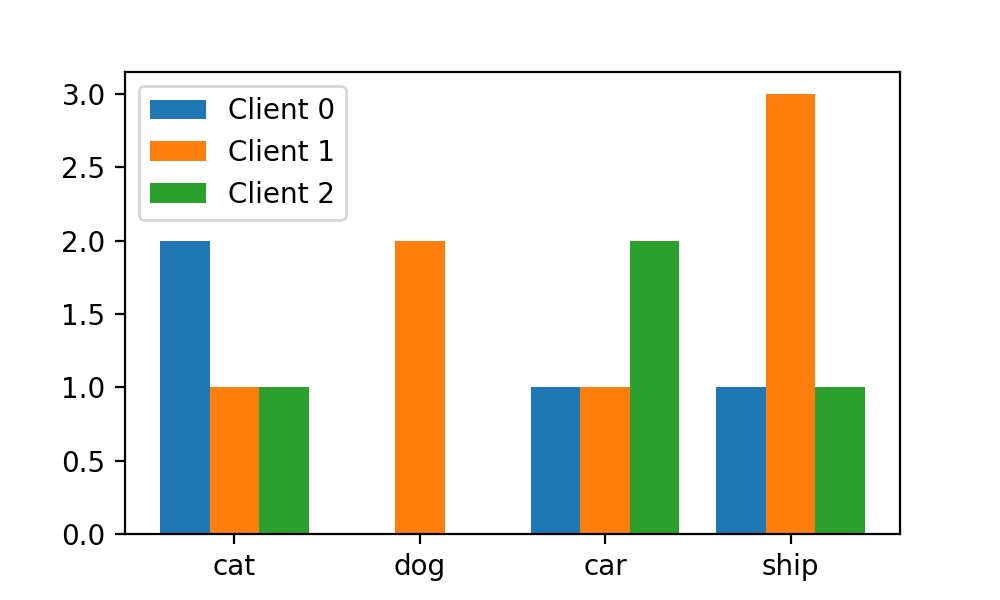
就大众审美而言,我们想让每个区域的中心和对应x轴刻度对齐,这第一个区域的区间为
[-0.5, 0.5)
,第二个区域的区间为
[0.5, 1.5)
,依次类推。则最终的
bins
序列为
[-0.5, 0.5, 1.5, 2.5, 3.5]
。于是,我们将
hist
函数修改如下:
plt.hist([train_labels[idc]for idc in client_idcs], stacked=False,bins=np.arange(-0.5, 4, 1),label=["Client {}".format(i) for i in range(N_CLIENTS)])
这样,每个划分区域和对应x轴的刻度就对齐了:
stacked参数
有时x轴的项目多了,每个x轴的对象都要设置3个bar对绘图空间无疑是一个巨大的占用。在这个情况下我们如何压缩空间的使用呢?这个时候参数
stacked
就派上了用场,我们将参数
stacked
设置为
True
:
plt.hist([train_labels[idc]for idc in client_idcs],stacked=Truebins=np.arange(-0.5, 4, 1),label=["Client {}".format(i) for i in range(N_CLIENTS)])
可以看到每个x轴对象的bar都“叠加”起来了:

不过,新的问题又出来了,这样每x轴对象的bar之间完全没有距离了,显得十分“拥挤”,我们可否修改
bins
参数以设置区域bin之间的间距呢?答案是不行,因为我们前面提到过,
bins
参数中只能将区域设置为连续排布的。
换一个思路,我们设置每个bin内的bar和bin边界之间的间距。此时,我们需要修改
r_width
参数。
rwidth 参数
我们看文档中对
rwidth
参数的解释:
rwidth float or None, default: None
The relative width of the bars as a fraction of the bin width. If None, automatically compute the width.
Ignored if histtype is \’step\’ or \’stepfilled\’.
翻译一下,
rwidth
用于设置每个bin中的bar相对bin的大小。这里我们不妨修改为0.5:
plt.hist([train_labels[idc]for idc in client_idcs],stacked=True,bins=np.arange(-0.5, 4, 1), rwidth=0.5,label=["Client {}".format(i) for i in range(N_CLIENTS)])
修改之后的图表如下:

可以看到每个x轴元素内的bar正好占对应bin的宽度的二分之一。
引用
- [1] https://matplotlib.org/stable/api/_as_gen/matplotlib.pyplot.hist.html