 爱站程序员基地
前言
为了按照常规WEB布局,这里全部采用拥有header和footer模式进行左中右布局编写。
第一种:基于float实现
实现思路
常规思路,使左右两个Aside分别浮动至左右两侧即可
代码实现
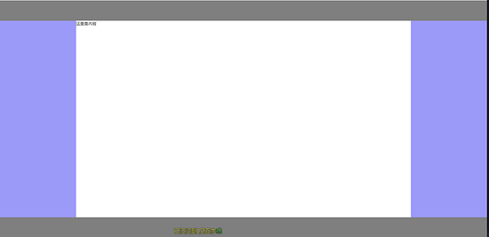
<!-- HTML部分 --><div class="container"><!-- 顶部Header --><header>这里是头部</header><!-- 中间aside及content --><div class="middle clearfix"><aside class="left"></aside><aside class="right"></aside><!-- 中间content显示内容 为了防止将右侧挤下去故放置在右侧栏下方 --><div class="content">这里是内容</div></div><!-- 底部Footer --><footer></footer></div><!-- CSS部分 --><style lang="scss">* {margin: 0;padding: 0;}.clearfix {zoom: 1;&::after {display: block;content: \' \';clear:both}}html, body {width: 100%;height: 100%}.container {width: 100%height: 100%header {height: 80px;background: rgba(0, 0, 0, 0.5)}footer {height: 80px;background: rgba(0, 0, 0, 0.5)}.middle {height: calc(100% - 80px - 80px)aside {height: 100%;width: 300px;background: rgba(156, 154, 249, 1)}.left {float: left}.right: {float: right}}}}</style>
实现效果
第二种:基于position:absolute实现
实现思路
为中间三栏父级赋予position: relative,赋予左右Aside position: absolute,并且分别赋予left: 0 right: 0 width:自定义值,赋予中间content left,right 分别等于左右width即可
代码实现
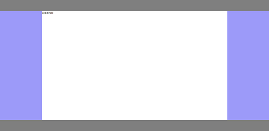
<!-- HTML相关代码 --><divclass="container"><!-- 顶部Header --><header></header><divclass="middle"><!-- 左侧Aside --><asideclass="left"></aside><!-- 中间content内容 --><divclass="content">这里是内容</div><!-- 右侧Aside --><asideclass="right"></aside></div><!-- 底部Footer --><footer></footer></div><!-- CSS相关代码 --><style lang="scss">* {margin: 0;padding: 0}html, body {width: 100%;height: 100%}.container {width: 100%;height: 100%;header {height: 80px;background: rgba(0, 0, 0, 0.5);}footer {height: 80px;background: rgba(0, 0, 0, 0.5);}.middle {height: calc(100% - 80px - 80px);position: relative;aside,.content {position: absolute;}.left {width: 300px;background: rgba(156, 154, 249, 1);left: 0;height: 100%;}.right {width: 300px;background: rgba(156, 154, 249, 1);right: 0;height: 100%;}.content {left: 300px;right: 300px;}}}</style>
实现效果

第三种:基于display:flex实现
实现思路
赋予左中右三列父级display: flex,赋予左右Aside width自定义,赋予中间content flex:1即可
代码实现
<!-- HTML相关代码 --><div class="container"><!-- 顶部Header --><header></header><div class="middle"><!-- 左侧Aside --><aside class="left"></aside><!-- 中间content内容 --><div class="content">这里是内容</div><!-- 右侧Aside --><aside class="right"></aside></div><!-- 底部Footer --><footer></footer></div><!-- CSS部分 --><style lang="scss">* {margin: 0;padding: 0;}html, body {width: 100%;height: 100%;}.container {header {height: 80px;background: rgba(0, 0, 0, 0.5);}footer {height: 80px;background: rgba(0, 0, 0, 0.5);}.middle {display: flex;height: calc(100% - 80px - 80px);aside {width: 300px;background:rgba(156,154,249,1);}.content: {flex: 1;}}}</style>
实现效果

第四种:基于display: table实现
实现思路
赋予左中右三列父级display: table, width: 100%,分别赋予左中右三列display: table-cell,分别赋予左右Aside width即可。
代码实现
<!-- HTML相关代码 --><div class="container"><!-- 顶部Header --><header></header><div class="middle"><!-- 左侧Aside --><aside class="left"></aside><!-- 中间content内容 --><div class="content">这里是内容</div><!-- 右侧Aside --><aside class="right"></aside></div><!-- 底部Footer --><footer></footer></div><!-- CSS部分 --><style lang="scss">* {margin: 0;padding: 0;}html, body {width: 100%;height: 100%;}.container {header {height: 80px;background: rgba(0, 0, 0, 0.5);}footer {height: 80px;background: rgba(0, 0, 0, 0.5);}.middle {display: table;width: 100%height: calc(100% - 80px - 80px);aside {width: 300px;display: table-cell;background:rgba(156,154,249,1);}.content: {display: table-cell;}}}</style>
实现效果

第五种:基于display: grid实现
实现思路
赋予左中右三列父级display: grid,并且使用grid-template-columns: 300px auto 300px,将其分为宽为300px、auto、300px三列布局即可。
代码实现
<!-- HTML相关代码 --><div class="container"><!-- 顶部Header --><header></header><div class="middle"><!-- 左侧Aside --><aside class="left"></aside><!-- 中间content内容 --><div class="content">这里是内容</div><!-- 右侧Aside --><aside class="right"></aside></div><!-- 底部Footer --><footer></footer></div><!-- CSS部分 --><style lang="scss">* {margin: 0;padding: 0;}html, body {width: 100%;height: 100%;}.container {header {height: 80px;background: rgba(0, 0, 0, 0.5);}footer {height: 80px;background: rgba(0, 0, 0, 0.5);}.middle {display: grid;grid-template-columns: 300px auto 300px;height: calc(100% - 80px - 80px);aside {background:rgba(156,154,249,1);}}}</style>
实现效果
到此这篇关于详解CSS多种三列自适应布局实现的文章就介绍到这了,更多相关CSS 三列自适应布局内容请搜索脚本之家以前的文章或继续浏览下面的相关文章,希望大家以后多多支持脚本之家!


