 爱站程序员基地
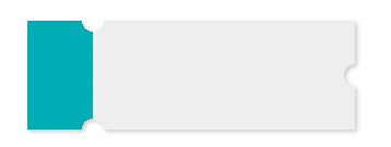
本文主要介绍了css圆形镂空(常用做优惠券背景图),分享给大家,具体如下:
.hollow-compose-three-circles {width: 300px;height: 100px;position: relative;background: radial-gradient(circle at right top, transparent 10px, #00adb5 0) top left / 60px 51% no-repeat,radial-gradient(circle at right bottom, transparent 10px, #00adb5 0) bottom left /60px 51% no-repeat,radial-gradient(circle at left top, transparent 10px, #eeeeee 0) 60px 0/230px 51% no-repeat,radial-gradient(circle at left bottom, transparent 10px, #eeeeee 0) 60px 50px /230px 51% no-repeat,radial-gradient(circle at 10px 50px, transparent 10px, #eeeeee 0) 290px 0/10px 100px no-repeat;filter: drop-shadow(2px 2px 2px rgba(0,0,0,.2));}.hollow-compose-three-circles::after {content: \'\';height: 80px;border: 1px dashed #fff;position: absolute;left: 60px;top: 0;bottom: 0;margin: auto;}<div class="hollow-compose-three-circles"></div>
<!doctype html><head><meta charset="UTF-8"><title>process</title><style>body{background: gray;}.many-circles {margin: 10px 0 0 40px;width: 200px;height: 100px;background: radial-gradient(circle at right, transparent 10px, #00adb5 0) top right / 51% 60px no-repeat,radial-gradient(circle at left, transparent 10px, #00adb5 0) top left / 51% 60px no-repeat;/*radial-gradient(circle at top right, transparent 10px, #eeeeee 0) bottom right / 51% 40px no-repeat,radial-gradient(circle at left top, transparent 10px, #eeeeee 0) bottom left / 51% 40px no-repeat;*/filter: drop-shadow(2px 2px 2px rgba(0,0,0,.2));}</style></head><body><div data-v-85036100="" class="many-circles"></div><script></script></body></html>
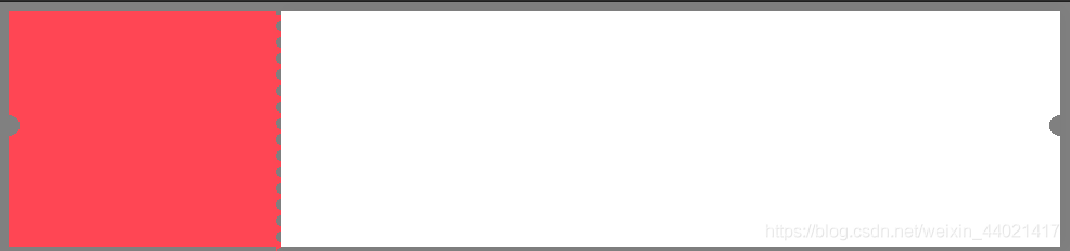
效果如下

<style>body{background: gray;}.hollow-one-circle{display: inline-block;width: 246px;height: 218px;position: relative;background: radial-gradient(circle at 0 106px, transparent 10px, #FF4654 0) top left/246px 100% no-repeat;}.hollow-one-right{display: inline-block;width: 718px;height: 218px;position: relative;background: radial-gradient(circle at 718px 106px, transparent 10px, #ffffff 0) top left/718px 100% no-repeat;box-shadow:3px 0px 13px 0px rgba(0,0,0,0.03);}.hollow-one-circle::before {content: \'\';position: absolute;height: 100%;width:5px;top: 4px;left: 246px;background-image: linear-gradient(to bottom, #FF4654 5px, transparent 5px, transparent),radial-gradient(10px circle at 5px 10px, transparent 5px, #FF4654 5px);background-size: 5px 15px;}.hollow-one-circle:after {}</style><div data-v-85036100="" class="hollow-one-circle"></div><div data-v-85036100="" class="hollow-one-right"></div>
到此这篇关于css圆形镂空(常用做优惠券背景图)的文章就介绍到这了,更多相关css 圆形镂空内容请搜索脚本之家以前的文章或继续浏览下面的相关文章,希望大家以后多多支持脚本之家!


