 爱站程序员基地
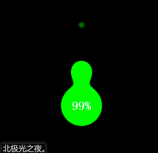
先看效果:
前言:
这个思路是我在b站看up主Steven做的,觉得很不错,然后自己也弄了一个。(纯css)
实现:
定义标签,有三个水滴盒子,一个圆圈盒子显示数字,一个最底层盒子:
<div class="kuang"><div class="droplet"></div><div class="droplet"></div><div class="droplet"></div><div class="quan"></div><span>99%</span></div>
给最底层盒子基本的样式。flex布局,这样3个水滴暂时会垂直居中排列。
.kuang{position: relative;height: 100vh;display: flex;flex-direction: column;justify-content: center;align-items: center;background-color: rgb(5,5,5);filter: contrast(30);}
filter: contrast(30);调整图像的对比度。值是0%的话,图像会全黑。值是100%,图像不变。值可以超过100%,意味着会运用更低的对比。若没有设置值,默认是1。
水滴的基本样式。绝对定位,这样3个盒子会重叠一起。
.droplet{position: absolute;width: 100px;height: 100px;border-radius: 50%;background-color: rgb(61, 233, 99);filter: blur(20px);animation: fall 3s linear infinite;opacity: 0;}
filter: blur(20px);给图像设置模糊。
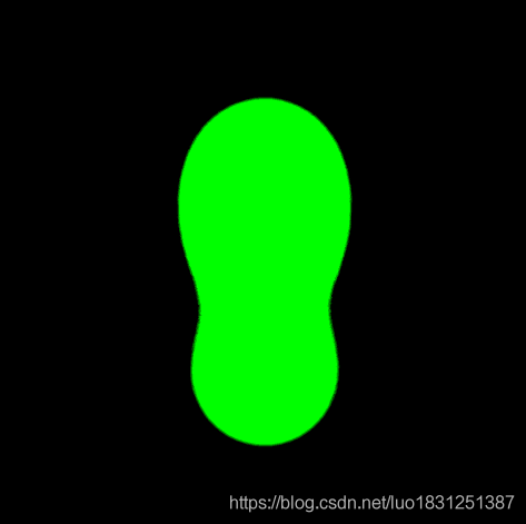
重点:我们给水滴盒子模糊度,这然三个水滴盒子会呈现一种模糊的状态。继而,我们给底层盒子设置图像对比度,这样模糊的图片会重新绘制轮廓,而得到下面的效果:
给要显示数字的圆圈基本样式。记住也要设置模糊度。这样在图像对比度下才会有与下落的水滴有融合的效果。
.quan{position: absolute;width: 100px;height: 100px;border-radius: 50%;background-color: rgb(61, 233, 99);filter: blur(20px);animation: zhuan 3s infinite;}
给水滴设置动画,让它们从上往下落下,期间大小发生变化,这些可以自己慢慢调试,设置成自己认为最好的效果。
@keyframes fall{0%{opacity: 0;transform: scale(0.8) translateY(-500%);}50%{opacity: 1;transform: scale(0.5) translateY(-100%) ;}100%{transform: scale(0.3) translateY(0px);}}
第2和和第3个水滴延迟时间后再播放动画,这样3个水滴才会分开下落,至于几秒可以自己慢慢调试,设置成自己认为最好的效果。
.kuang div:nth-of-type(2){animation-delay: 1.5s;}.kuang div:nth-of-type(3){animation-delay: 2s;}
给显示数字的圆圈动画效果,让它转起来。期间可以让它大小或角度发生或其它变化,具体数值可以自己慢慢调试,设置成自己认为最好的效果。
@keyframes zhuan{0%{transform: scale(1) rotate(0deg);}50%{transform: scale(1.1) rotate(180deg);height: 90px;border-top-left-radius: 45%;border-bottom-left-radius: 48%;}100%{transform:scale(1) rotate(360deg);}}
完整代码:
<!DOCTYPE html><html lang="en"><head><meta charset="UTF-8"><meta name="viewport" content="width=device-width, initial-scale=1.0"><title>北极光之夜。</title><style>*{margin: 0;padding: 0;box-sizing: border-box;}.kuang{position: relative;height: 100vh;display: flex;flex-direction: column;justify-content: center;align-items: center;background-color: rgb(5,5,5);filter: contrast(30);}.droplet{position: absolute;width: 100px;height: 100px;border-radius: 50%;background-color: rgb(61, 233, 99);filter: blur(20px);animation: fall 3s linear infinite;opacity: 0;}.kuang div:nth-of-type(2){animation-delay: 1.5s;}.kuang div:nth-of-type(3){animation-delay: 2s;}@keyframes fall{0%{opacity: 0;transform: scale(0.8) translateY(-500%);}50%{opacity: 1;transform: scale(0.5) translateY(-100%) ;}100%{transform: scale(0.3) translateY(0px);}}.quan{position: absolute;width: 100px;height: 100px;border-radius: 50%;background-color: rgb(61, 233, 99);filter: blur(20px);animation: zhuan 3s infinite;}@keyframes zhuan{0%{transform: scale(1) rotate(0deg);}50%{transform: scale(1.1) rotate(180deg);height: 90px;border-top-left-radius: 45%;border-bottom-left-radius: 48%;}100%{transform:scale(1) rotate(360deg);}}span{position: absolute;color: rgb(184, 182, 182);font-size: 26px;font-family: \'fangsong\';font-weight: bold;}</style></head><body><div class="kuang"><div class="droplet"></div><div class="droplet"></div><div class="droplet"></div><div class="quan"></div><span>99%</span></div></body></html>
总结:
到此这篇关于html+css实现充电水滴融合特效代码的文章就介绍到这了,更多相关html 水滴融合内容请搜索脚本之家以前的文章或继续浏览下面的相关文章,希望大家以后多多支持脚本之家!


